ARISA - Eclipse Sound Scape
Interactive Map Design
User Experiences Design-Real Client Group Project
Designed by Kaiqing Su, Joanne Tang, Siri Pothuri.
Timeline
Apr-May, 2023
Design Role
UI/UX Designer,
UX Researcher
The case was presented to ECLIPSE SOUNDSCAPE by NASA in April 2023.
Problem statement
Participants in the Eclipse Soundscapes project often find it hard to determine from the website whether or not their locations are in the eclipse path and to know when the maximum phase occurs in their locations in accessible ways compared to other websites that provide interactive maps. This is a problem for target users to submit their observations of the eclipse efficiently, which lowers the impact of the project outcome. This is also a problem for target users with disabilities as it requires more time for them to participate in this project.
Project Background and Research Findings
-
No existing interactive eclipse map on the website.
-
Other eclipse maps including Google, TimeandDate, and Stellarium show the eclipse time and date but have limited functions and instructions for users.
-
Existing maps barely have enough accessible assistance for people with impairments.


Design System with all the colors going through WCAG2.0 color contrast testing
Our Goal
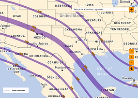
Create a new interactive map with
-
onboarding instruction
-
search bar by city name and zip code
-
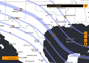
solar eclipse visible path
-
duration time
-
solar eclipse maximum and partial begins time
-
solar eclipse maximum and partial ends time
-
annual solar eclipse countdown
-
accessibility consideration in color and keyboard control
Design and User Testing
Adjusting layouts and features of the map
-
minimize the instruction to the "help" button
-
enlarge the size of the map on the website
-
run several times of color contrast according to WCAG's guidelines
-
match the keyboard movement control to Google's keyboard control, ensuring consistency


Biggest Problems To Solve
While designing the onboarding instructions, we struggled with the format and the form of displaying it. We sketched three forms of instruction displays and ran through in-class user testing:
-
hidden instruction in the "help" button or a "?" button; (winner!)
-
shortened instructions below the map, directly displaying on the website;
-
or, onboarding tutorial for the first time using the map.
Working towards the dark mode, we had trouble with the color contrast. The original map colors are not light yellow and blue (for dark mode white and black), which had a lower color contrast. Instead, those two colors had higher color contrast, but it would be hard to find a color for the solar eclipse path. Finally, we gave up part of the color contrast and prioritized the contrast on the solar eclipse path and the map as a whole, as our goal is to show the information clearly on this interactive map.

Other than color contrast, we put extra effort into the keyboard movement of the map. By looking into Google's accessibility control instructions and user reviews, we found that keyboard control should follow a certain standard or worldwide common rules so that users wouldn't have to get used to different control rules.
Next Steps:
-
Usability testing, particularly with the screen reader
-
Better integration of the keyboard accessibility instructions
-
Multilingual search feature